Here are a few to start off with. Photoshoppers, please help, and feel free to come up with your own designs if you don't like these. This is just a quick example.


Here are a few to start off with. Photoshoppers, please help, and feel free to come up with your own designs if you don't like these. This is just a quick example.

I really think you need to incorporate the skull in some manner, it is just so cool.
Originally Posted by Dan Druff

wow - druff this done be bad -
retry ftw druff
slim t
Really rough draft, but you get my idea,

Of all the money e'er I had, I spent it in good company
^^^ Close Templar lol. Perhaps extend your outer line upwards to make a 'diamond'.
Never mind, I guess you have the diamond, well-played lol.
I don't really like the three fishes / sperms idea. Keep it simple. Something like (quick sketch)
Do whatever font you like, change colours, use a different skull like the one in the logo on the top of the page, but at least this gives an idea. The spade tells us it is cards, the red tell us to watch out (fraud), and the skull tells us there is danger. And of course, most important, the name is prominent. Also, the design must be consistent with the current brand / logo. I don't really like the yellow / gold - I would suggest going to red and also updating the logo on the top of the page. The logo on top of the page is the brand as of now, and if you want something new - ok (and I do recommend doing it), but you really should keep your brand consistent on the website and t-shirt.
You also have to think about what colour t-shirt this will be shown on. White? Black? Some other colour? You also have to think about the space you have to work with on the t-shirt. My sketch may actually be too wide to work (with the .com included). T-shirts, are kind of 4x3 shaped layout if you place the graphic on the front chest area.
I agree with Mad Dad and Lurker. I hate the 3 fishes idea, no offense to whomever designed it. Have to use the skull and crossbones.
Only one PFA logo I'll ever want on a shirt.

horrible designs, druff
choose wisely, as branding/logos are very important in terms branding
i would place more importance on designing a logo for a cap...you never know, you or a pfa member can make a final table, as unlikely as that seems
all of these are horrible...and i remember seeing jasep's version of samual l jacksons head shot saying something like "pfa is serious motherfucking business"..i never laughed so hard when he proposed that. i thought it was in this thread. i was wrong..
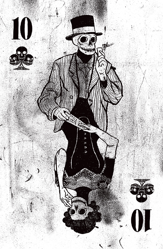
just google "skeleton playing cards' or variations of that AND GO from there.
use a goth type font and put it on quality hanes beefy white and black t shirts....you coulkd make 100 of these silkscreened for prolly around 5/7bux each

Nice bump.
I want a shirt.
these were my hat ones
is that poopy between his legs?
quad draghonus or les
take the top half of this image and turn it into gold.
this is even better.

i actually think this would work as both a banner and t shirt. minus the text black cock.
There are currently 1 users browsing this thread. (0 members and 1 guests)


 Reply With Quote